100 Best Free Fonts 2014 – Part 3
100 Best Free Fonts 2014 – Part 3
Choosing the right font for your project can make or break your design. Here at Verve we know that building a large font library can be an expensive and daunting proposition. This is why we have assembled some of our favourite free fonts to form Verve’s 100 Best free fonts of 2014. There are some great Sans and Serif fonts, A superb selection of display and decorative typefaces and a smattering of solid web fonts throughout! We will be releasing this in 4 parts so make sure you follow us on social media, Bookmark our page or sign up to the newsletter to make sure you don’t miss the rest of this fantastic collection.
There really is something for every project in this collection, I hope you love these as much as the team here at Verve Graphic Design & Marketing.
Note: Please be sure to check the exact licence terms for each font – some are free for personnel use some can be used commercially. Further details can be found after clicking download.
< View Part 2
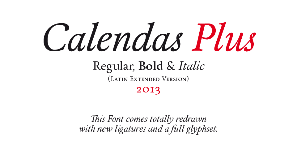
51. Calendas Plus
Calendas is a typeface with a classical air, great legibility and elegance, designed for work in small sizes. Its special characteristics derive from its calligraphic finishing.
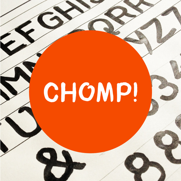
52. Chomp!
Handwritten and playful font.
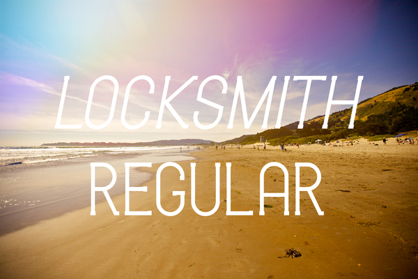
53. Locksmith Regular
Crisp and modern font with minimal serif’s giving a very distinctive look.
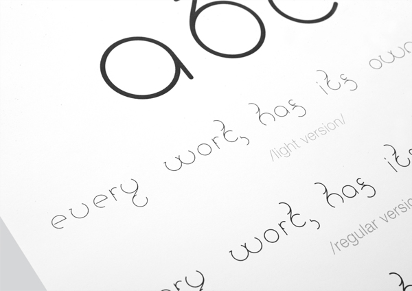
54. Universum
This display typeface design is all based on a circle and its own variation. This typeface is suitable for a posters and print design.
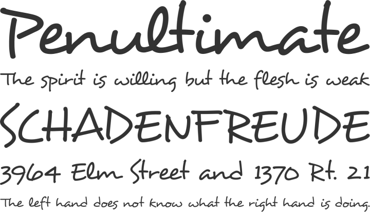
55. Desyrel
Attractive hand drawn font with a child-like charm.
56. High Tide
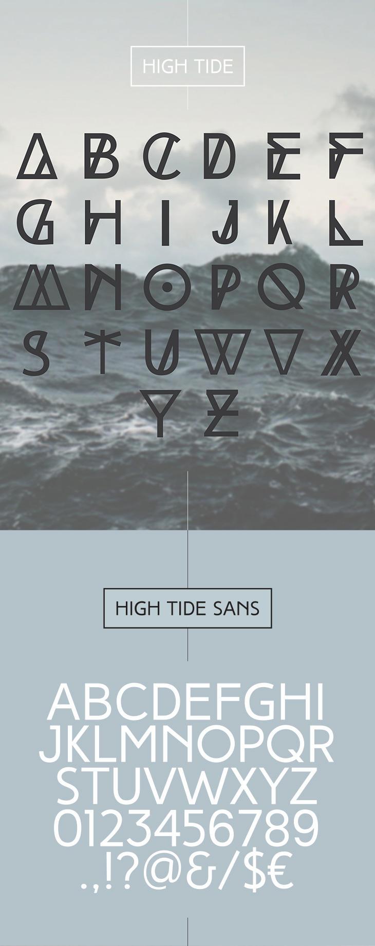
Fontfabric type foundry presents High Tide – unique free font family of three completely different weights – Regular, Bold and Original!
High Tide is an all caps, decorative typeface designed to be most suitable for titles, headlines, posters, logos, etc.
57. Accent
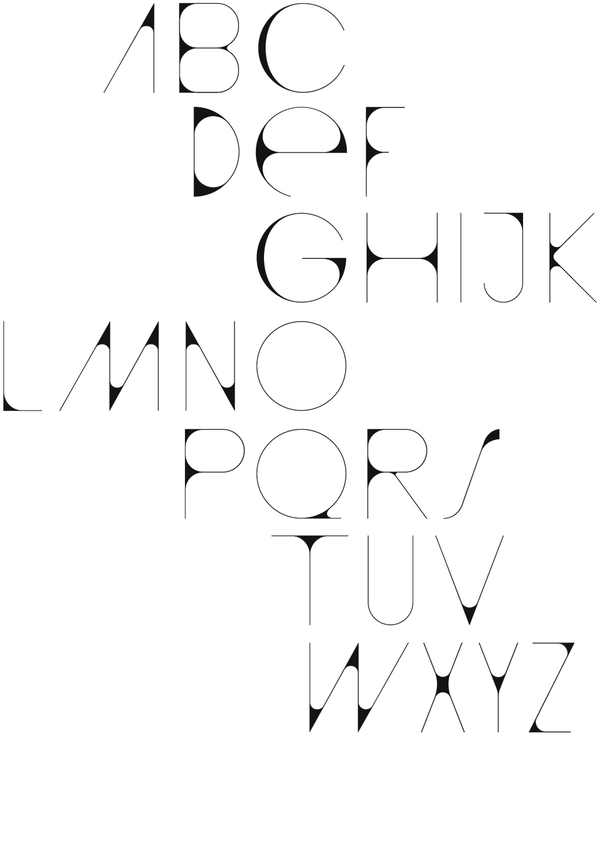
Accent is a free for commercial use display typeface designed by Nelson Balaban.
58. Reckoner
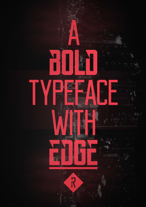
Drawing inspiration from popular industrial sans serif typefaces such as Bebas Neue, Alegre Sans & Dharma Gothic, Reckoner is a typeface with a modern twist whilst keeping the fundamentals of a traditional font.
59. Born
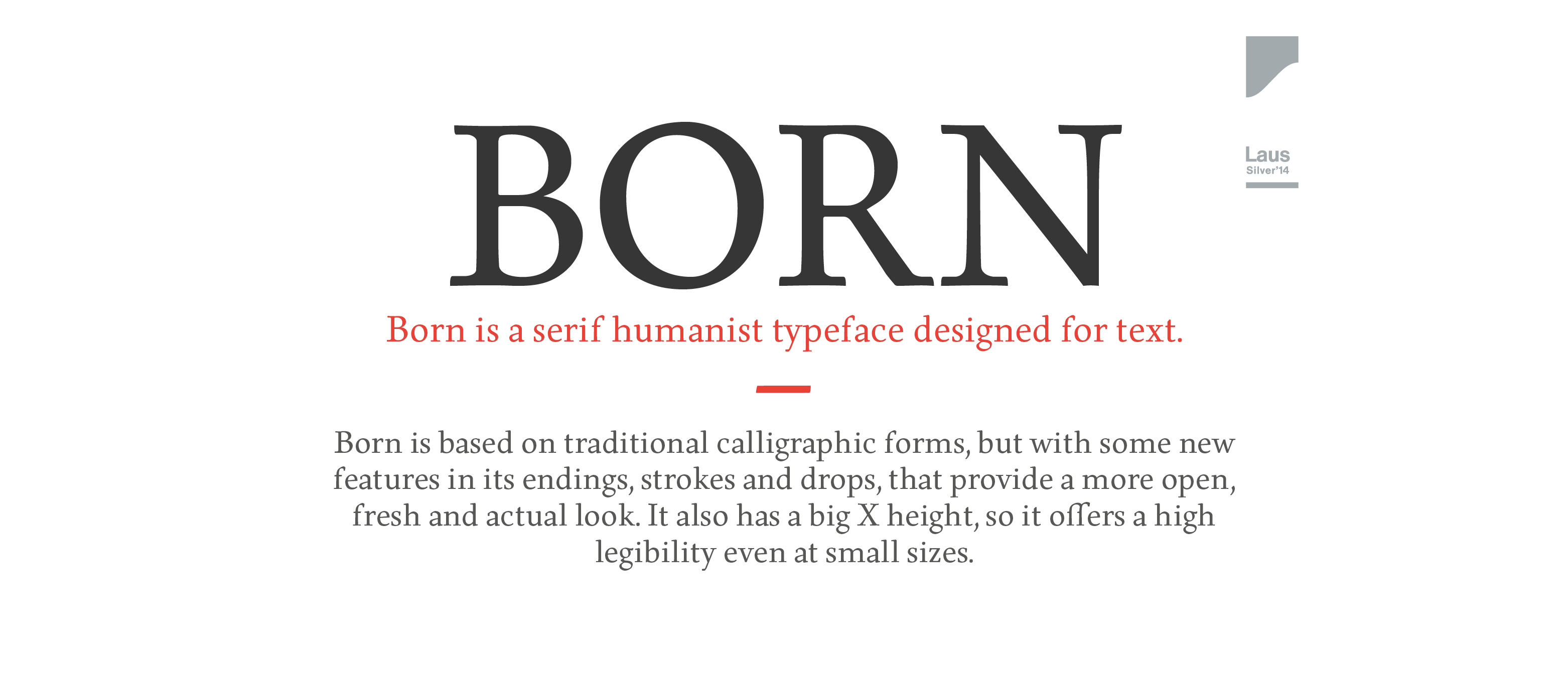
Born Regular includes a total of 262 glyphs: Uppercase, Lower case, Alternative glyhps of the above ones, normal Ligatures, Uppercase numerals and symbols and punctuation marks.
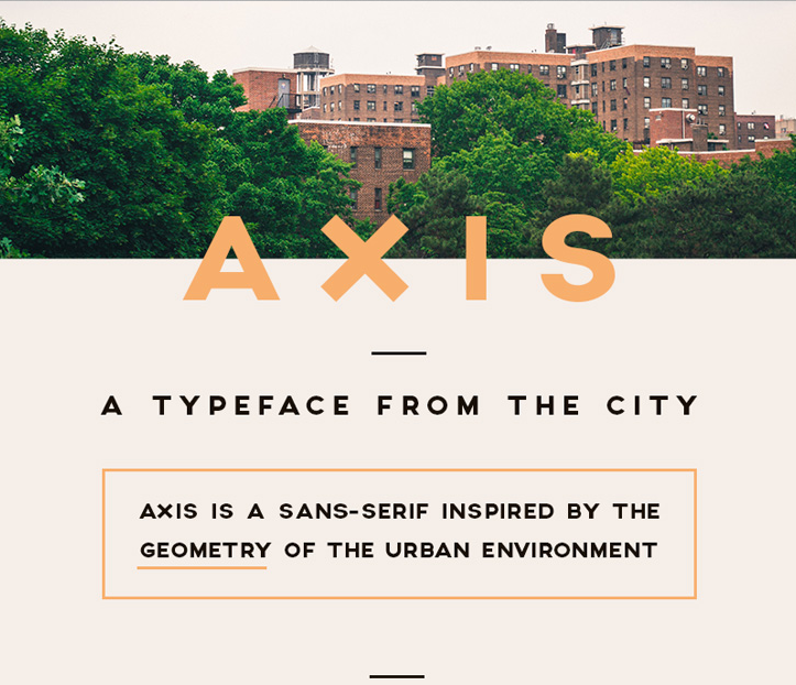
60. Axis
Axis is a sans-serif inspired by the geometry of the urban enviroment.
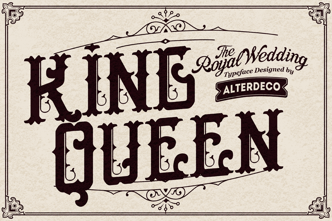
61. Epique
Epique typeface, it’s a victorian and ornamental typeface, it’s inspired by old victorian and ornamental typography design, with a modern and clean shape and it’s perfect for creating a wedding invitation (initial),a headline, or logotype, or even a t shirt/apparel design.
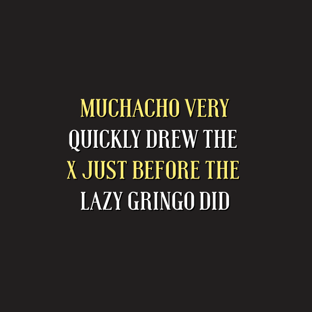
62. MUCHACHO
Western style serif typeface with quirky legs.
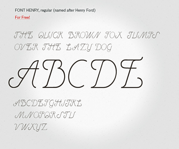
63. Henry
Henry, after Henry Ford, was inspired by vintage cars and fonts from the 60s.
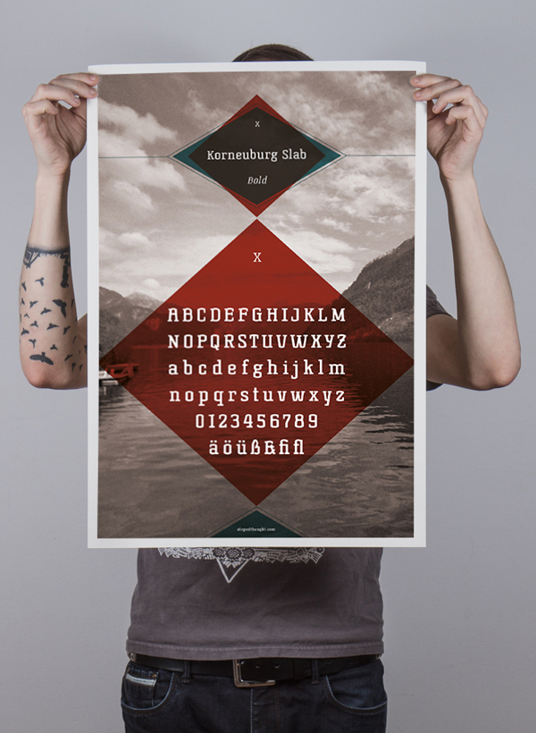
64. Korneuburg Slab
A text font with character and great legibility..
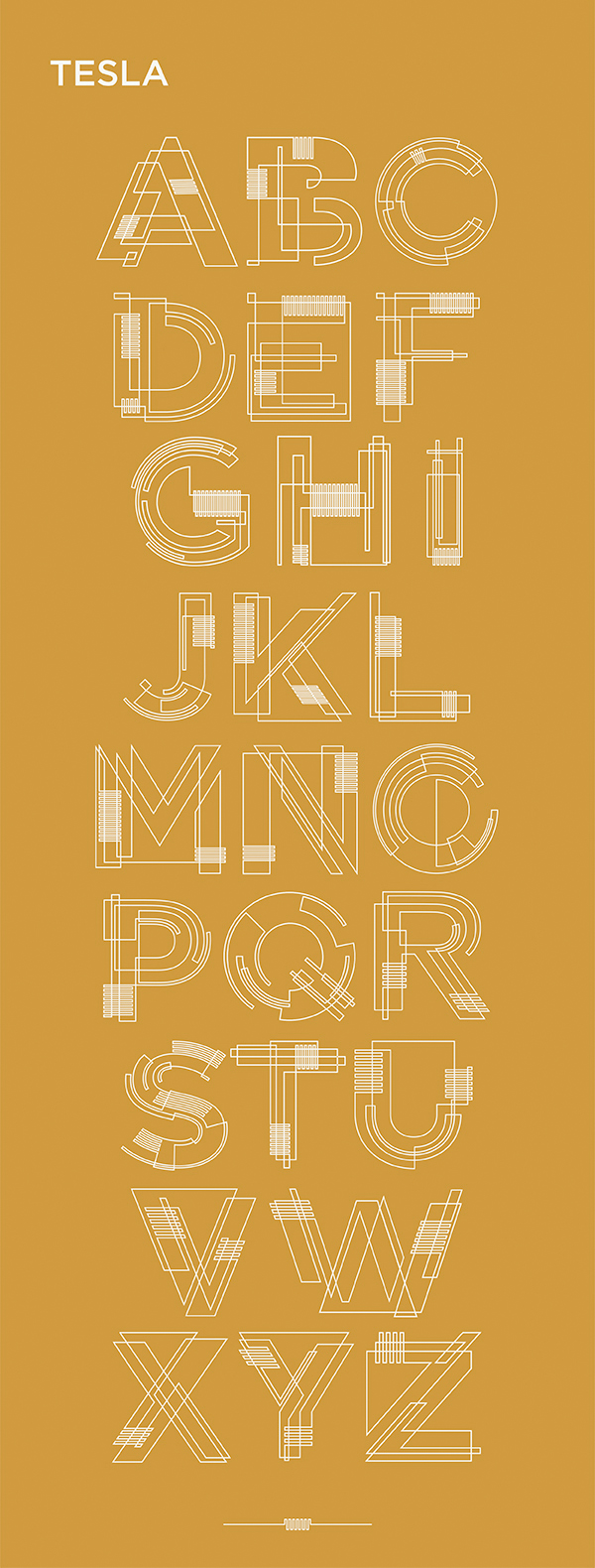
65. Tesla
The inspiration for this typeface was found in the circuitry of lightbulb filament and wiring intricately crossing paths.
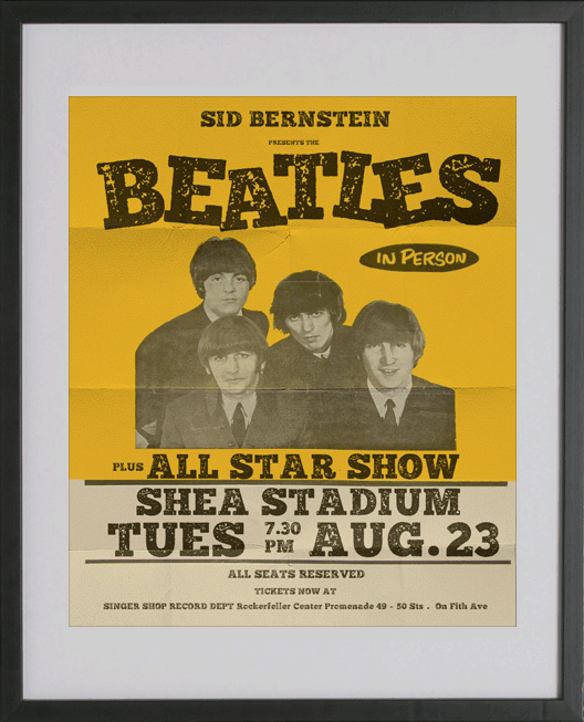
66. Distractor
This is Distractor, loosely based on Bevan. The inspiration behind this font was the old letterpress styles and hand printed lettering – I just love that hand printed style.
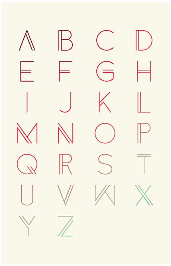
67. Anders
Stylish san serif font.
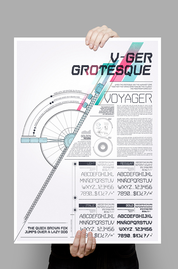
68. V.GER Grotesque
Stylish san serif font.
69. Magna
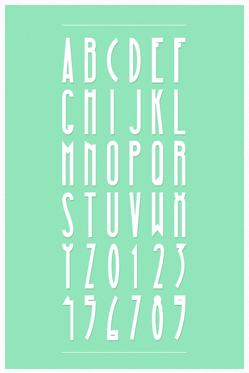
MAGNA is a free typeface based on a “vintage” style. The typeface contains all main characters (from A to Z – capitals & lowercases are the same for the moment) and numbers (from 0 to 9).
70. Porto
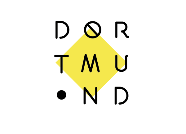
Porto was born to be part of a logo design that didn’t turn to be what was needed, re-imagined as a font.
71. Nexa Slab
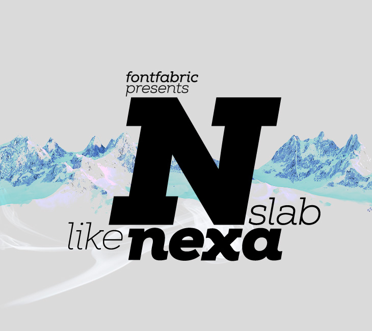
Nexa Slab is a geometric slab serif font whose design is based on the already popular best-seller Nexa.
The font family contains 3 basic forms: italics, obliques and uprights, each of which has 8 different weights. This visual richness makes it the ideal slab serif font family for the web as well as for print, for motion graphics, logos, t-shirts and so on. It is also great for headings, fitting nicely with both small and large typesetting text blocks.
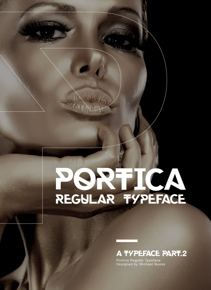
72. Portica
PORTICA™ is a simple sans serif Typeface designed by Michael Nunes.
Based on the skeleton of Helvetica.
Creating a new font based on the visual trend of expressive typography. Although, there are a lot of typefaces focusing on similar principles, Portica tries to find its place with its strong lines and robust body.
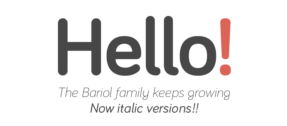
73. Bariol
Elegant rounded san-serif available in 4 weights.
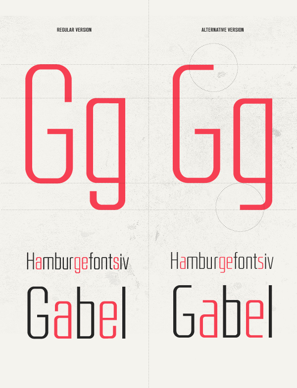
74. RBNo2
BNo2 is a new gothic sans serif font designed by Rene Bieder for Fontfabric.
It is inspired by late 19th century industrial fonts with german roots regarding straightness and geometry. Combined with other sans serifs, slab serifs and serif fonts it catches the eye when used in headlines and short copy texts. Additonally to the regular styles the alternate versions will turn the font into a perfect partner for modern, technical and contemporary impressions as well as high quality, luxury and timeless environments.
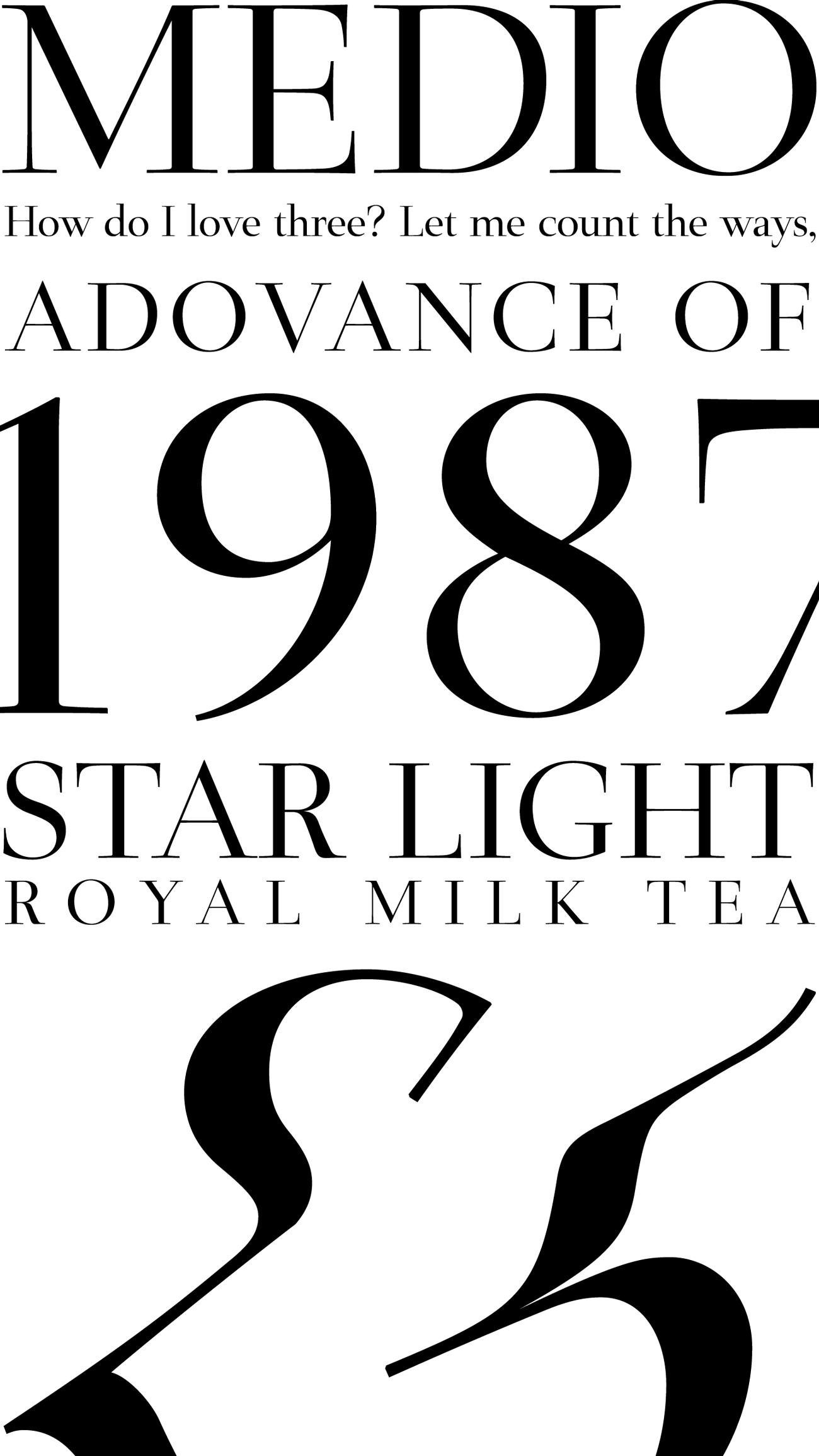
75. Medio
Modern and crisp serif font.
Don’t forget to bookmark this page, follow us on social media or sign up to the newsletter to get the next three instalments!.
If you enjoyed this article don’t miss our guide to 27 Superb Sites With Royalty Free Stock Images For Commercial Use
