7 Design Tips for Creating Promotional Banners that Convert
7 Design Tips for Creating Promotional Banners that Convert
Whilst every eCommerce website is different, promotional banners are generally found on the homepage (above the fold) and throughout the user journey to inform visitors about offers, new products, company news or simply to make a make an impact on the page.
With the hundreds of free design programs available today, just about anyone can design these promotional banners for their eCommerce website. But designing a banner and designing a banner that encourage clicks are two very different things!
So how can you design and create promotional banners that will convert? Below are our top 7 tips and general guidelines for designing promotional banners.
1. Create hierarchy
Hierarchy applies order to your designs, and makes sure the most important elements are seen first. This is crucial for homepage banners as they are the first thing visitors see when they land on your site.
Every promotional banner needs two elements: a value proposition, and a call to action (CTA).
Value proposition:
This is the bulk of your banner. It is the message that showcases not only what service or product you are offering to the visitor, but how your product or service can benefit them. The message should be concise – 3 to 10 words is ideal. Think things like: “High quality” or “50% off” or “For a limited time only.” The message should take up most of the space on your banner and be the first thing that viewers’ eyes see.
Call to Action (CTA):
This is the text or button that invites visitors to click. Phrases like “Learn more”, “Get started” or “Buy Now” are great examples. It’s important to tell users they need to perform an action. (Yes, sometimes we are still a pretty impressionable bunch that require clear instructions.)
The CTA should be a clear focal point on your banner. It is the end goal – what you have to get your visitors to click on in order for the banner to be successful.
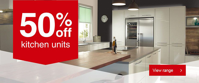
Wickes Homepage Banner
2. One banner = one message
Your visitors are too busy while browsing and have little time to read all the offers you’ve put on a single promotional banner and they are even less likely to choose from multiple calls-to-action. So, one banner should equal one message and ideally your landing page linked to this banner should also focus on this exact offer.
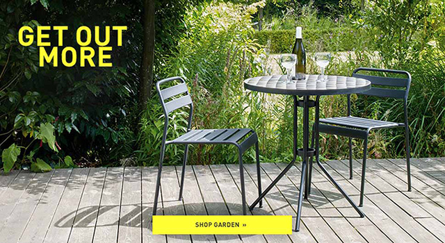
Habitat Homepage Banner

Tesco Direct Category Page Banner
3. Keep it simple
You’ve tried some cool animations, contrasting colours, photo collages but the banner performance still leaves much to be desired… Now it’s time to keep things really simple – a short headline, copy written in simple language, and a traditional red-coloured CTA button.
You may be surprised at how well your banner will perform after all this simplification.
A great way to encourage this is by using white space. White space is any negative or unused space in a design (fun fact – it doesn’t need to actually be white). For example, look at this John Lewis promotional banner.
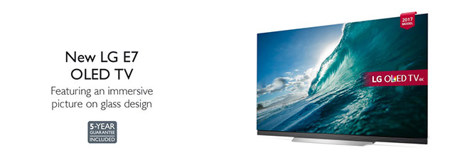
John Lewis Homepage Banner
All of the unused background space is white space (or blank space).
Now what’s so great about white space? Take a look at the banner above, now think about what your eye focused on first when looking at it. I’d be willing to bet you started with the words “New LG E7 OLED TV” then went right to the image.
The white space in this banner forces you to focus on one thing and one thing only. Think about the Google home page:
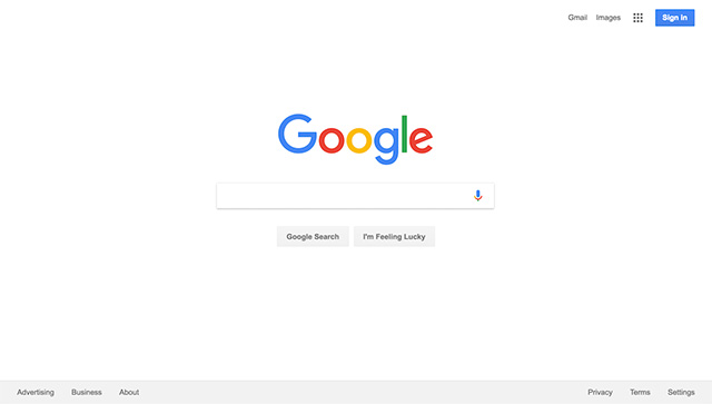
There is literally nothing on the page except for the search bar. No distractions, no frills, just the one thing that is important. This is exactly what white space can do for your promotional banner. By leaving blank space you can draw focus to what is important – your proposition/message, and your call to action.
4. Make text instantly readable
Do’s
Order your title, subtitle and body copy by size. These elements are the three musketeers of typography. From largest to smallest, these should be read in a naturally progressive order.
Your title is the first thing that your visitor will read, so make sure it stands out. This can be done by making sure it’s the biggest in size, and using a strong eye-catching font. The subtitle should support your title at a relatively smaller type size. Body copy is the smallest and should be clear and easy to read.
As a rule of thumb, copy should be four lines or less.
Also try mixing up your font styles. Most fonts come in different styles and weights, for example bold and italic, which can be especially useful when trying to draw attention to certain aspects of your design. Words that deserve a special note, like ‘sale’ or ‘limited time only’, are great to treat with a different font style.
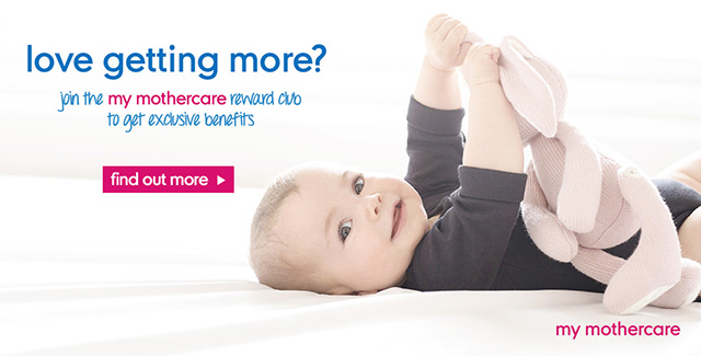
Mothercare Homepage Banner
Dont’s
Avoid cursive/script fonts, extremely thin font weights, all uppercase copy, or font sizes smaller than a 10 pt (unless it’s a disclaimer or copyright notice). This can force strain on the reader’s eye and makes the overall text much harder to read.
5. Choose appropriate colors
Every colour has a different association, and it’s important to consider what types of emotions you want to evoke in your audience.
Colour not only evokes feelings but can also create a level of distinction between what is important and what is not. Applying a bright, bold colour to a significant feature will highlight and draw the eye to it, making it a focal point within your design.
Top tip: Use a colour picker tool to match the text colour with a colour in the background of your image.
6. Use appropriate imagery
Using just colour on your banners can end up being a little bit one dimensional. Especially on eCommerce sites, it’s often important to include product images and other lifestyle imagery to encourage clicks.
But be sure to choose relevant imagery that enhances your message and is directly related to your product or service. Avoid abstract concepts.
Can’t afford professional photography or models? Buy an affordable license for a stock library. There are millions of high quality libraries out there. Better still, opt for an original illustration or graphic created by a professional designer.
Top tip: When searching through an image library look for images with clear space for you to place your text instead of having to work around the composition.
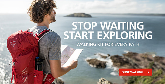
Cotswold Outdoor Homepage Banner
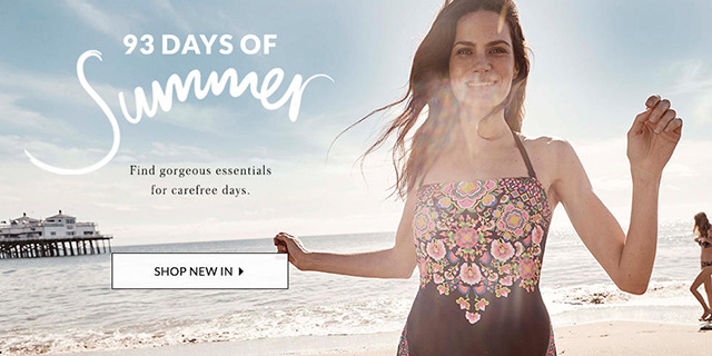
George Asda Homepage Banner
7. Save properly
Lastly, but extremely important. Your banner needs to load fast on a page before visitors scroll down and miss it. So you must insure your files aren’t too large and are properly formatted.
When it comes to file size, the smaller the better. The target file size should be somewhere around 300kb, depending on the size of the promotional banner.
Then make sure to save in a format that works across the web. Common file types for banners include JPG’s and PNG’s for static displays, and GIF for animated displays. As the popularity of SVG increases, this format is also becoming more widely accepted.
You’re ready to build better banners!
There you have it! 7 design tips to help you create clickable promotional banners – but it takes a lot more to create truly professional, high-performing banners. If you’re not a professional designer (or too busy running a business)…

